Navigation Bar · Case Study

Decoding Financial Complexity:
Overhauling Navigation for a
High-Volume Brokerage

How a data-led Information Architecture strategy transformed choice paralysis into an intent-driven, high-conversion user journey.

Duration
8 Weeks
Role
Lead UX Designer & Researcher
Expertise
IA · UX Strategy · Data-Led Design
Platform
5paisa Web
Background

A navigational failure at scale

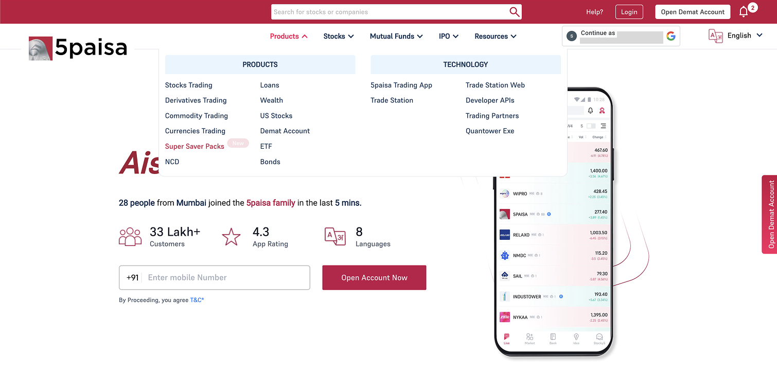
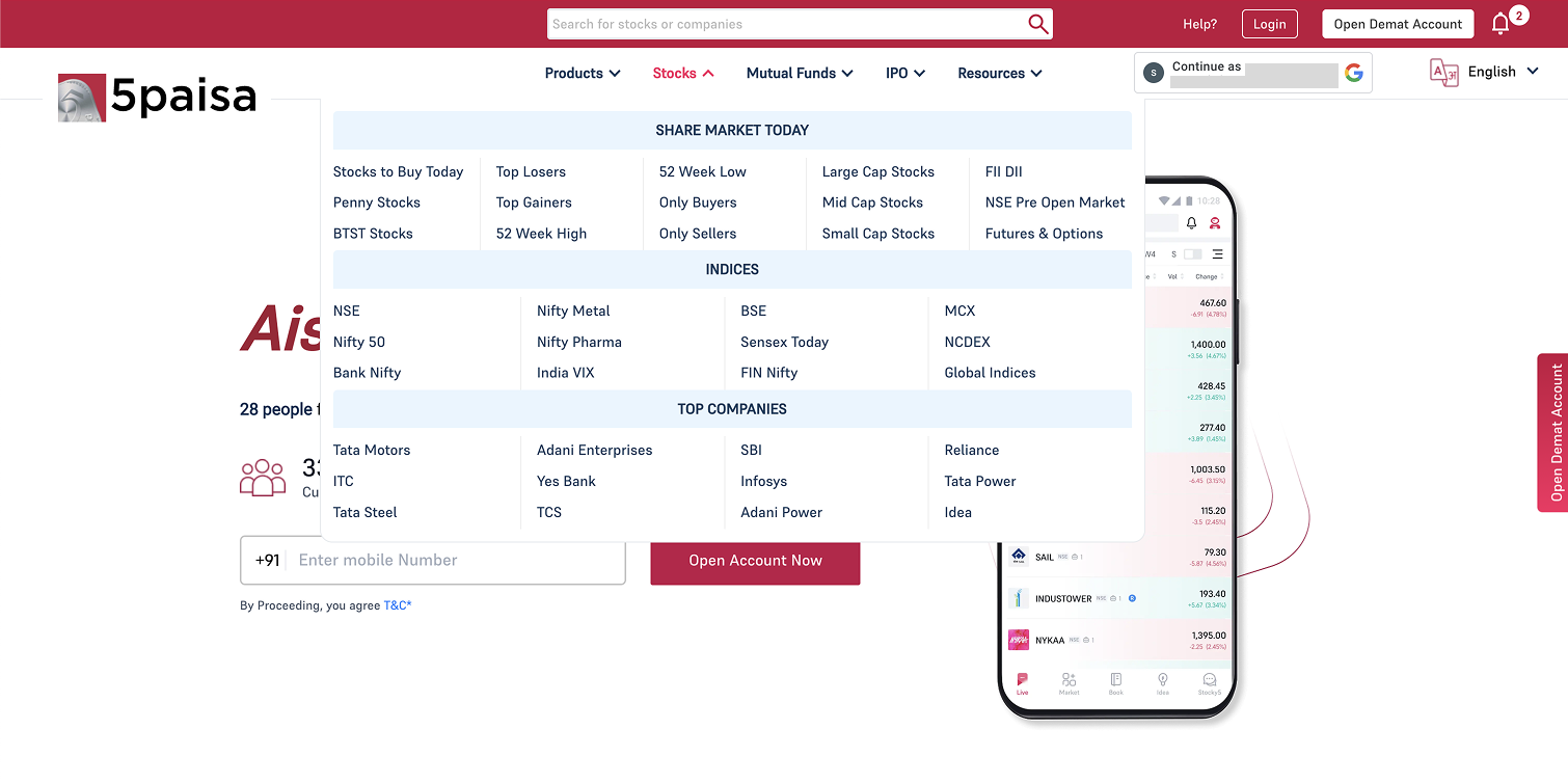
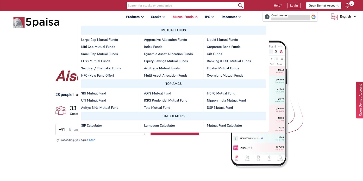
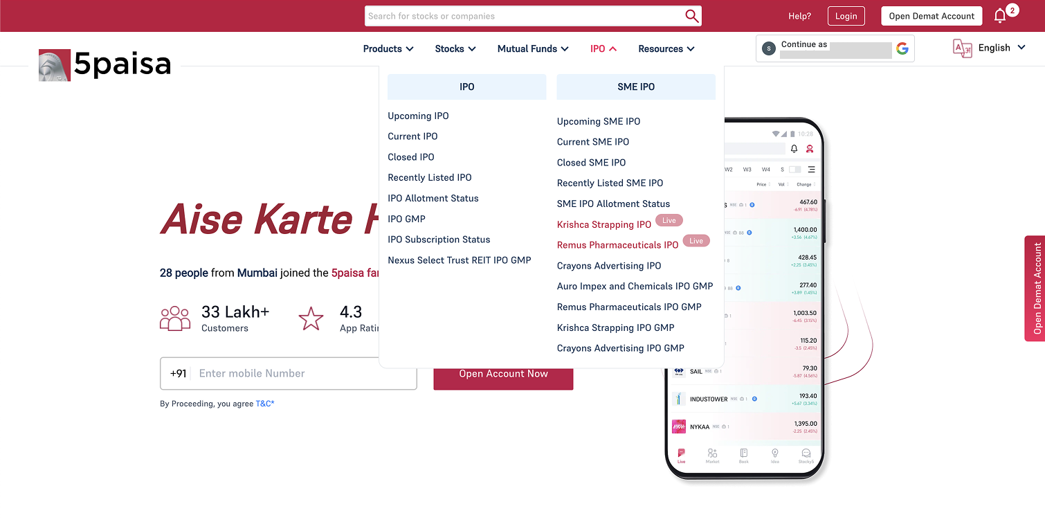
The project addressed a critical failure within a leading discount brokerage web platform. The legacy system operated on a product-centric "wall of links" model featuring over 119 entries under vague labels like "Technology" and "Resources."

This forced users into 3–4 clicks to reach any core product, resulting in severe cognitive overload and decision paralysis. Internal audits revealed a significant Metric Crisis where core revenue-generating assets like Mutual Funds and IPOs were virtually invisible.

By restructuring the IA into an intent-based hierarchy — specifically separating "Invest" from "Trade" — the goal was to restore user trust, reduce interaction costs, and dramatically boost discoverability.

Engagement Gap
1/50th
Core assets vs. Login route
Legacy Links
119+
Entries under vague labels
Interaction Depth
4
Clicks to reach core product
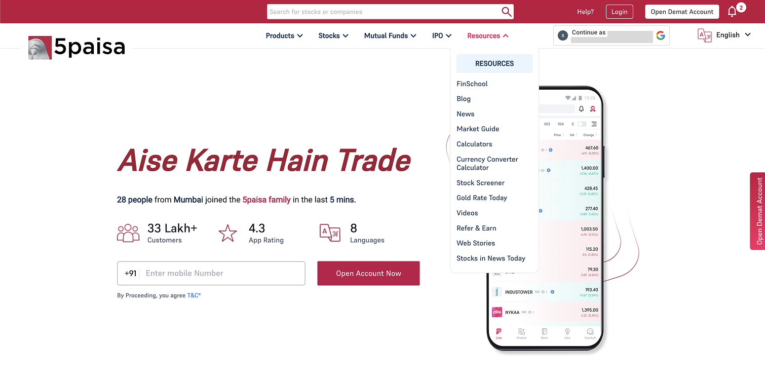
Legacy navigation — Products dropdown
Legacy navigation — Stocks dropdown
Legacy navigation — Mutual Funds dropdown
Legacy navigation — IPO dropdown
Legacy navigation — Resources dropdown
Legacy Nav · Products
Problem Identification

A three-pronged audit

To uncover root causes, I performed a multi-dimensional audit combining quantitative signals with qualitative IA analysis.

Quantitative Audit
Data-revealed invisibility
Core revenue-generating assets performed at less than 1/50th of the primary Login route. High-value features had near-zero organic discovery.
IA & Cognitive Load Audit
119-link wall of chaos
A product-centric "wall of links" forcing 3–4 clicks to reach any core product. Each nesting level added interaction cost and decision fatigue.
Taxonomy & Labeling Failure
Language that breaks trust
Critical sections labeled as "Technology" and "Resources" — completely failing to match user mental models for a trading platform.
Problem Statement

The existing navigation is an overwhelming "wall of links" causing severe cognitive overload. Due to poor categorization and misleading labeling, high-value products are functionally invisible — resulting in near-zero discoverability across core revenue segments.

The Process

Structured, data-driven from day one

An 8-week initiative with a disciplined process ensuring every decision was grounded in both user needs and business goals.

01
Empathize & Audit
Deep-dive into analytics to identify Metric Crisis areas. Manually mapped all 119+ legacy navigation links to quantify the full scope of the architecture problem.
02
Define & User Research
Conducted in-depth interviews with 12 participants spanning active traders to new investors, uncovering mental model mismatches in the existing taxonomy.
03
Competitive Benchmarking
Audited 5 leading FinTech platforms to identify proven patterns: limiting top-level items to 4–7 and using action-oriented, intent-based labeling throughout.
04
Ideate & Structure
Applied Hick's Law to reduce choices at each hierarchy level. Developed a new intent-based sitemap splitting navigation into "Invest" (long-term) and "Trade" (active execution).
05
Prototype & Design
Created high-fidelity mega-menus for all 6 navigation tabs. Revamped product names for clarity, developed color-coded iconography and micro-copy badges for the Products tab.
06
Validate & Handoff
Delivered annotated mockups with clearly defined success metrics for engineering alignment. Established KPIs to track post-launch CTR improvements across key product segments.
Research & Insights

12 users revealed four friction patterns

Interviews spanning active traders to new investors surfaced consistent, repeatable pain points — the qualitative "why" behind the quantitative data.

Finding 01 · Taxonomy Misalignment
Users bypassed "Technology" entirely
Users consistently skipped the "Technology" label when looking for trading tools. It simply didn't match their mental model of where a trading platform should live — creating an invisible wall around the most-used product.
Finding 02 · Category Confusion
"Pogo-sticking" between sections
Participants clicking "Stocks" or "Mutual Funds" expected a portal to trade — but found static market data. The expectation mismatch caused repeated back-and-forth "pogo-sticking" behavior, eroding trust.
Finding 03 · Labeling Friction
"Resources" felt generic and unappealing
High-value tools were buried under "Resources" — a label participants found non-descriptive and actively avoided. Some of the platform's most powerful features were hiding in plain sight behind the worst possible label.
Finding 04 · Market Data Misplacement
Power users couldn't find time-sensitive data
High-priority data like BTST and Penny Stocks were buried in static product folders — creating significant friction for power users who need real-time analytics without transactional clutter surrounding them.
Competitive Benchmarking & Design Strategy

Learning from leaders, applying UX law

Market Patterns (5 Platforms Audited)
Standardizing ComplexitySuccessful competitors limit primary navigation to 4–7 top-level items, validating the need to eliminate our 119-link legacy structure.
Intent-Based LabelsIndustry leaders use action-oriented, user-centric labels — "Trade" instead of generic product groupings — reducing cognitive effort at first glance.
Functional SeparationTop platforms clearly differentiate transactional links from support and educational resources — preventing user intent collision.
Design Strategy Applied
Hick's Law AppliedDecreased decision-making time by limiting choices at each hierarchy level — transforming "choice fatigue" into a streamlined path to action.
Intent-Centric CategorizationMoved from product-centric to user-intent model — splitting primary navigation into "Invest" (long-term growth) and "Trade" (active execution).
Taxonomy CorrectionMoved platforms from "Technology" to "Products," pulled live data into "Markets" — each label now matching real user terminology.
Solution & IA Transformation

From chaos to clarity: 66% fewer choices

Consolidated 119+ legacy links into ~40 high-intent destinations. Flattened the architecture from 4 levels deep to a maximum of 2 levels at any point in the navigation.

IA Transformation — Before vs. After
Before — Legacy System
119+
Navigation entries across vague, mislabeled categories
Wall of Links 4-Level Deep Nesting "Technology" Label "Resources" Tab Product-Centric Choice Paralysis 3–4 Clicks to Core
After — Intent-Driven System
~40
High-intent destinations, max 2 levels deep
6 Clear Top Tabs Max 2-Level Depth "Products" Tab "Markets" Hub Intent-Based Model Invest vs. Trade Split 66% Fewer Choices
Information Architecture After Redesign
INVEST TRADE PRODUCTS PRICING MARKETS LEARN PARTNER INVEST INVESTMENT PRODUCTS Stocks Mutual Funds IPOs ETF US Stocks NFO TOOLS Brokerage Calculator SIP Calculator Stock Comparison Stock Screener ELSS Calculator Compare Mutual Funds All Calculators 13 items TRADE TRADING PRODUCTS Futures & Options Commodities TOOLS Margin Calculator MTF Calculator Stock Screener All Calculators 5 items PRODUCTS 5PAISA PRODUCTS 5paisa Trading App Trader's Terminal AlgoSpace 5paisa EXE T+5 FnO 360 Xstream APIs Publisher Js MTF 5paisa MCP Scalper Terminal Trade on Charts 12 items PRICING Redirect MARKETS SUB-NAVIGATION Market Movers Stocks Pop. Stocks Indices IPO Mutual Funds MARKET MOVERS Market Today Volume Shockers 52 Week High Value Shockers 52 Week Low Only Buyers FII DII Only Sellers Top Gainers F&O Ban List Top Losers Active Contracts STOCKS Nifty 50 Large Cap Sensex Mid Cap MUTUAL FUNDS Categories AMCs Schemes 20+ items LEARN Redirect PARTNER Redirect Product / Content Item Tool / Calculator ↗ Redirect = no dropdown, opens page directly ~40 high-intent destinations · down from 119+ legacy links · 66% fewer choices
Final Design — Tab-by-Tab Breakdown

Intent-driven navigation tabs

Each tab designed around a specific user intent — moving from a product dump to a purposeful, action-oriented architecture where every section earns its place.

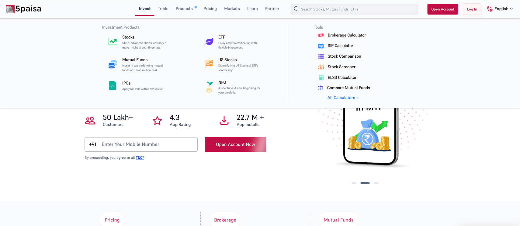
Tab 01 · Long-Term Wealth Creation
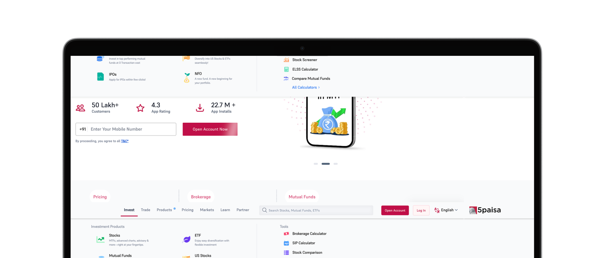
The "Invest" Tab
Dedicated exclusively to strategic, long-term investment products — a clean, uncluttered entry point to wealth-building instruments, completely free from active trading noise.
  • Houses Stocks, Mutual Funds, IPOs, ETFs, and US Stocks
  • Integrated contextual right-hand column with high-intent calculators
  • Brokerage, SIP, ELSS, and Stock Screener tools surfaced prominently
  • Completely separated from active trading to prevent cognitive collision
Invest tab design
Tab 02 · Active Execution & Speculation
The "Trade" Tab
Built for high-frequency, active instruments — cleanly separated from beginner investment avenues so experienced traders can execute without drowning in informational noise.
  • Houses Futures & Options and Commodity instruments
  • "Tools" column shifts dynamically to surface Margin and MTF Calculators
  • Active execution pathway distinct from long-term Invest tab
  • Reduces cognitive collision between novice and expert user flows
Trade tab design
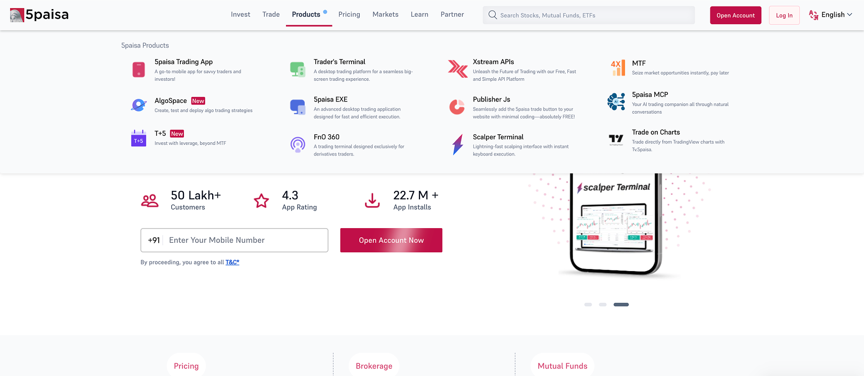
Tab 03 · The Taxonomy Correction
The "Products" Tab
Completely retired the ignored "Technology" label. Proprietary platforms are now explicitly organized under a word users actually understand — driving immediate recognition and engagement.
  • Retired the underperforming "Technology" category entirely
  • Trading App, Trader's Terminal, FnO360, Scalper Terminal now front and center
  • Color-coded iconography with micro-copy badges for instant recognition
  • Taxonomy now aligned with real user language and mental models
Products tab design
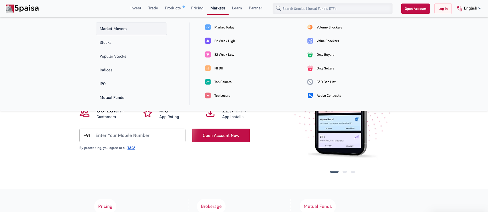
Tab 04 · The Real-Time Utility Hub
The "Markets" Tab
Pulled 25+ live analytics and directory links out of static transactional folders into a dedicated real-time hub — serving power users without creating clutter for casual investors.
  • 25+ live analytics and directory links centralized in one dedicated hub
  • Two-tier layout: left quick-switch submenu populates data grids on the right
  • Market Today, Top Gainers/Losers instantly accessible for active traders
  • Time-sensitive data separated from static transactional product folders
Markets tab design
Results & Business ROI

Measured impact across four dimensions

Strategic outcomes from the IA overhaul — metrics normalized for NDA compliance. The redesign created compounding value across discoverability, efficiency, and platform trust.

300%+
Core Product Discoverability
Projected CTR lift across non-equity segments (Mutual Funds, IPOs) after moving high-value assets out of deep nested submenus into intent-based top-level tabs.
66%
Reduction in Cognitive Load
Consolidated 119+ legacy links into ~40 high-intent destinations — a 66% reduction in the number of choices presented to any user at any navigation level.
4→2
Interaction Depth Flattened
Minimized maximum user journey depth from 4 levels to 2 — dramatically reducing interaction cost to reach any core product or platform feature.
Platform Engagement Boost
Retiring "Technology" in favour of "Products" instantly boosted engagement with proprietary trading platforms — connecting users to tools they were actively looking for but couldn't find.
Lead UX Reflection

What this project taught me about design leadership

In Prasham's Words

"Steering this Information Architecture overhaul taught me that a Lead UX Designer's responsibility extends far beyond visual aesthetics. True leadership lies in the ability to balance dense business requirements with user simplicity.

The core challenge wasn't just drawing the lines of a new sitemap — it was securing buy-in from multi-departmental stakeholders to eliminate nearly 66% of legacy content. By anchoring my strategy in established psychological frameworks like Hick's Law and supporting it with qualitative user interview patterns, I shifted the internal conversation from 'how much content can we fit?' to 'how quickly can a user take action?'

The resulting ecosystem proves that in complex, high-stakes digital spaces, minimizing choices is the single most powerful way to build user trust and accelerate business conversion."

PC
Prasham Chavda
Senior Product Designer · 5paisa Capital