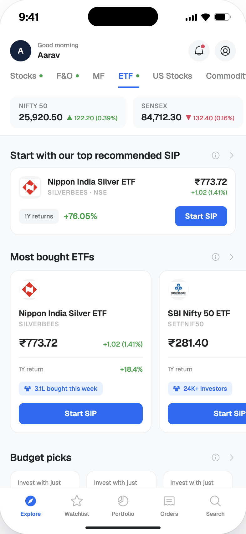
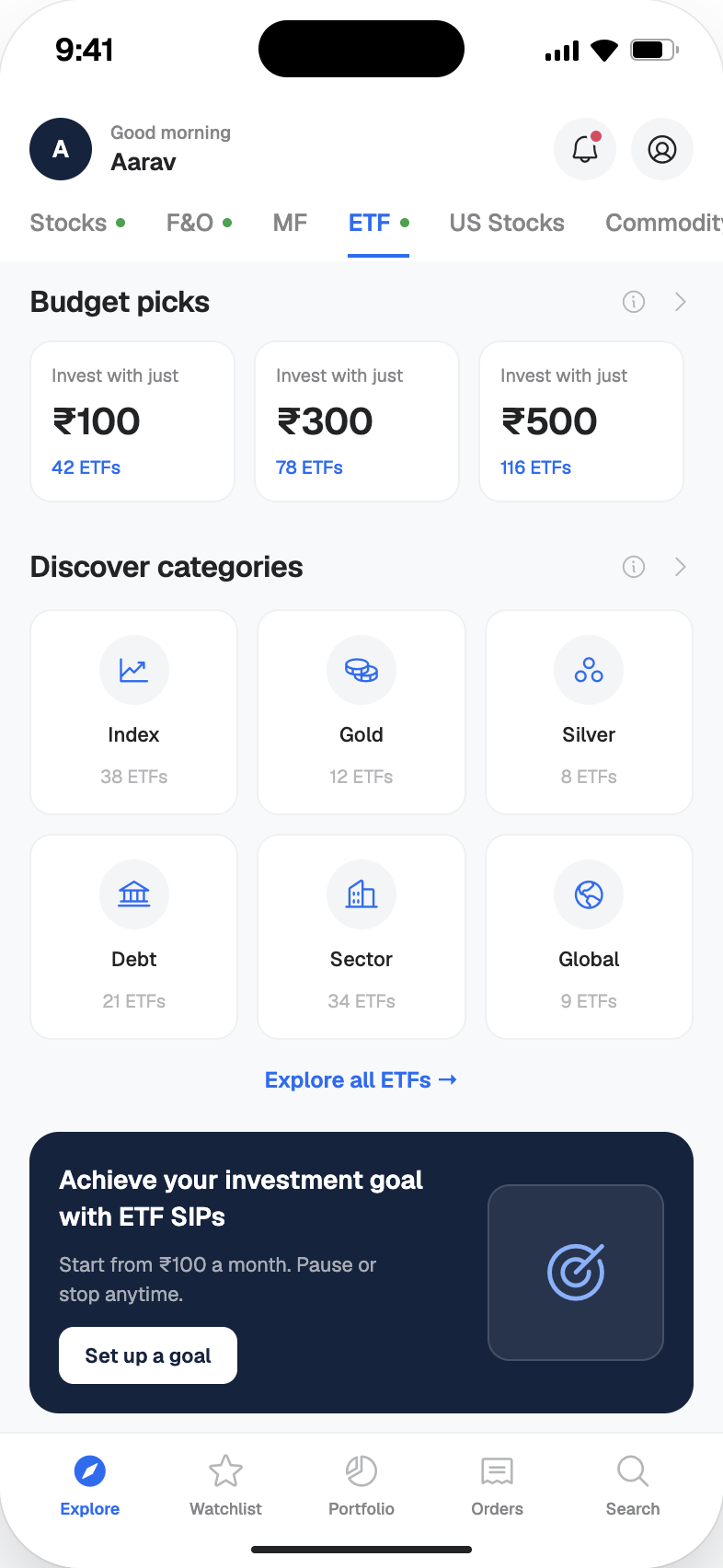
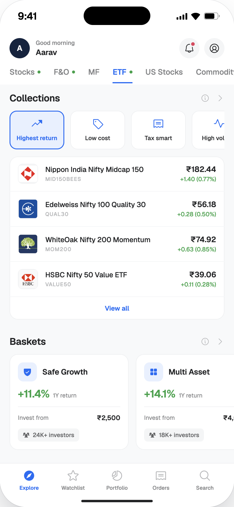
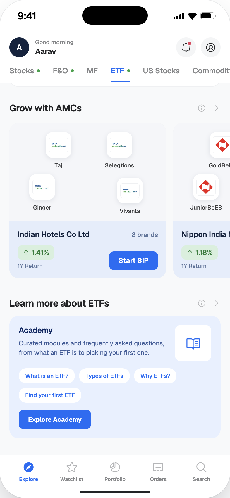
Designed investment product ETF with its dashboard, detail page and buy journey for 5paisa. Led strategy, UX, and UI across mobile and web, resulting in an 81% surge in ETF turnover.
View Prototype
Source: CleverTap (Nov → Dec 2025 · First month after launch)
Before this redesign, ETFs on 5paisa were buried inside the stocks product. It was a flat list of names, prices, and daily changes. There was no discovery, no context, no dedicated experience for the ETFs. Journey for the users trying to invest in ETFs started and ended with a number on a screen.
"How might we transform ETF from a list of assets into a discovery-first investment product that matches targeted user's intent?"
Analysed ETF market behaviour, investment patterns and industry data to understand the product landscape and identify gaps in the existing experience.
Users open the ETF section but don't know where to start. It is read as a flat, undifferentiated list of names.
Most user purchase ETF as investment of one time. They lack the benefits they can achieve by creating SIP.
ETF doesn't feel different from buying a stock, its distinct value as a product category is invisible to users.
Users form a goal before they browse, the intent ("I want something stable") precedes the product search.
Competitors anchor ETF discovery on categories like 'Tax saving' or 'High growth' outperforming plain search.
Users default to Nifty 50 or Gold ETFs they've heard of. Lesser-known ETFs are skipped regardless of performance.
Dashboard categories should not be based on asset type or product taxonomy. Mapped 7 user intent pillars based on research insight and then derived every dashboard section from those.
Introduced quick "Start SIP" CTAs as a first-action across the product and nudges about SIP benefits. This will be growth-oriented for both, user and business.
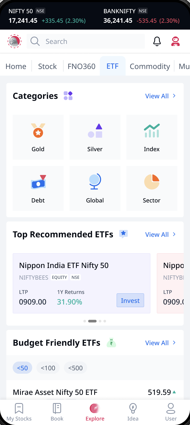
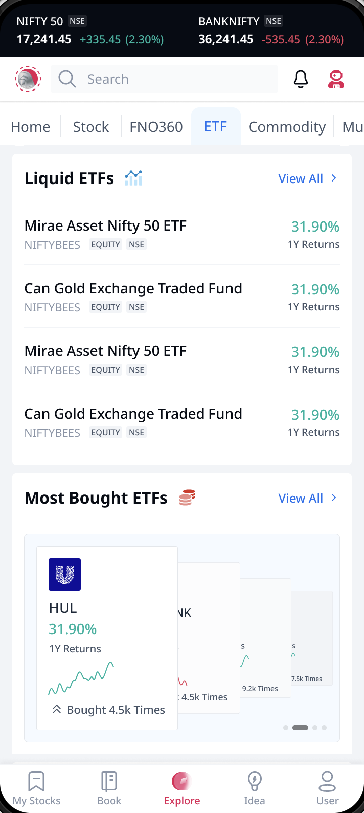
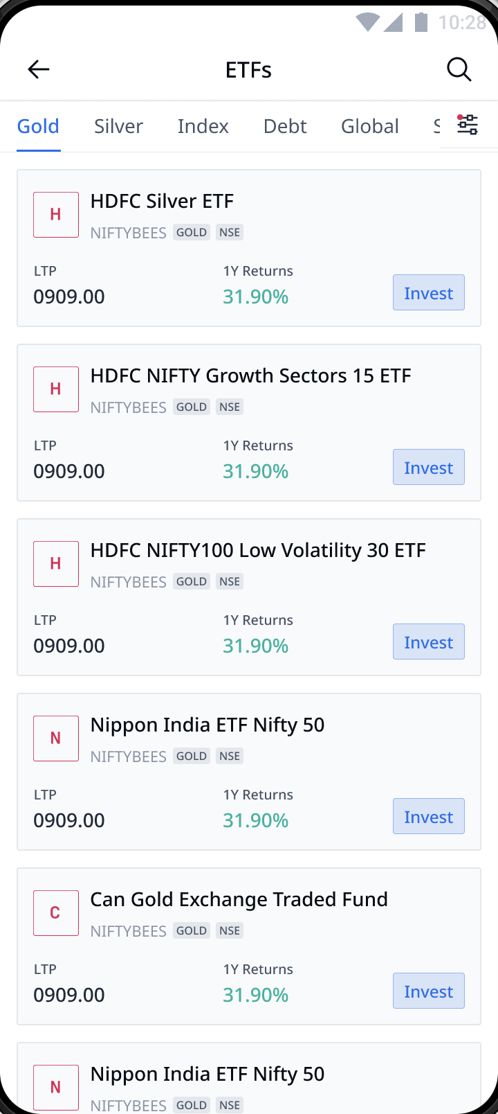
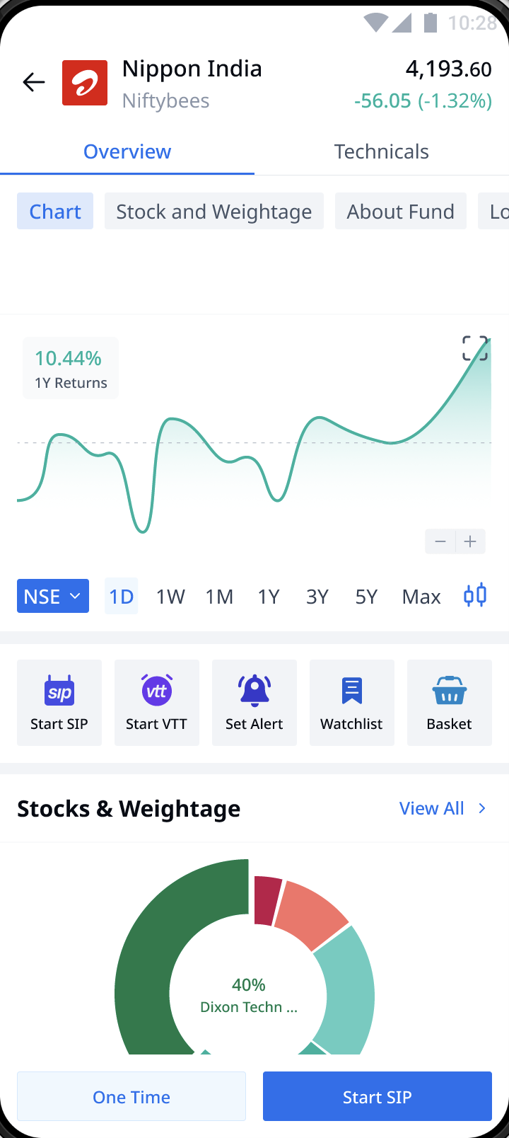
The ETF product was implemented on the 5paisa web platform, maintaining full feature parity with the mobile experience.
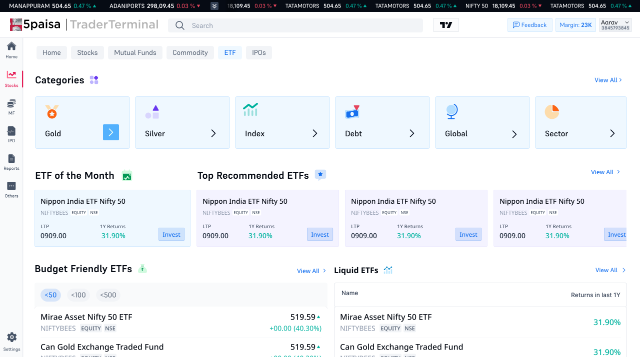
After launch, 5paisa underwent a full design system overhaul. All ETF screens were rebuilt to elevate visual consistency while maintaining every UX decision.
Anchoring discovery around what users are actually trying to do was the right call. It gave every design decision a clear rationale and made cross-functional alignment much easier. Deriving intent categories and creating sections out of that to show ETFs list removed the friction that had been very real to users.
I'd involve the engineering team earlier in the process. A few intent-based features were simplified late in delivery because of technical constraints we hadn't mapped to the design. Earlier collaboration would have preserved more of the nuance or found smarter solutions sooner.
Complexity in a financial product is often a symptom of unresolved product thinking not a design constraint. The biggest wins came not from polishing UI but from reframing how the product was structured. Design's leverage is highest at that layer.
The 81% turnover surge and 35% increase in active ETF clients happened in the first month post-launch. What mattered most wasn't any single screen, it was giving users the context and confidence to act. That's the design problem this project was really solving.